A Return to Greatness
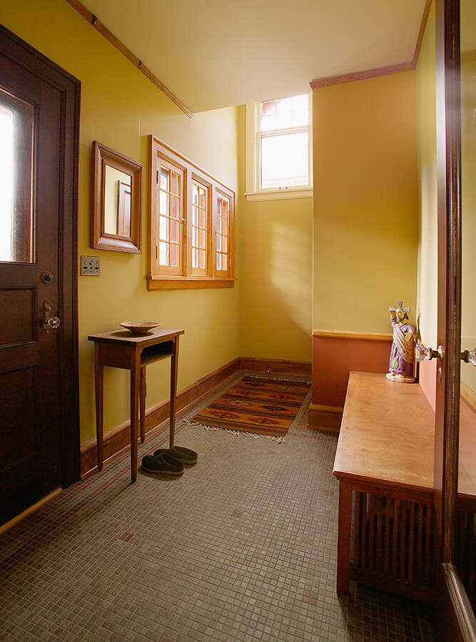
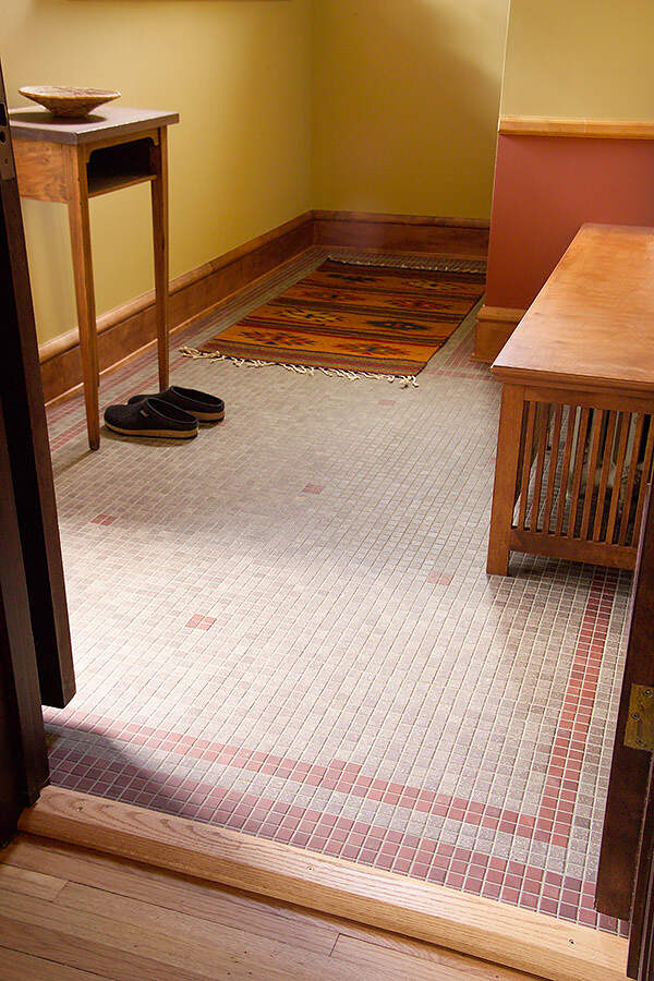
The homeowners had just purchased this 1912 Tudor style two-story and wanted to restore it to its former glory. This meant making some changes to the structure that may not have been in the original design in order to create a more functional and aesthetically pleasing space. Every room was extensively remodeled. The client’s top priorities were to remove the front staircase to create a larger entry, create a gallery for displaying and storing artwork, and add storage space in the master bedroom and bathroom.
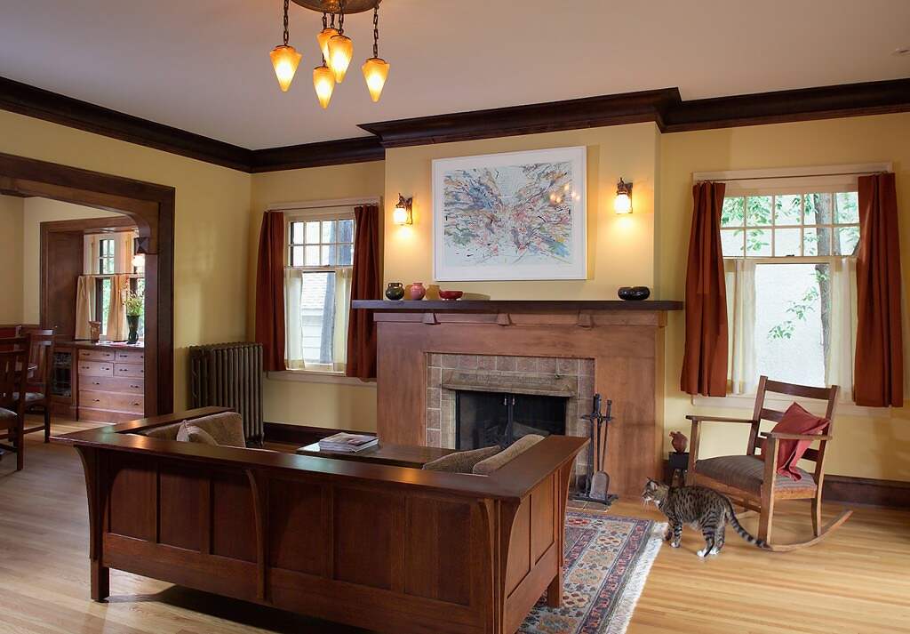
All of the doors, casing, and crown throughout the house (which were painted white) had to be stripped and refinished, requiring extensive labor. The baseboard and picture rail had been damaged and were missing in some places, so we decided to re-mill it for the entire house.
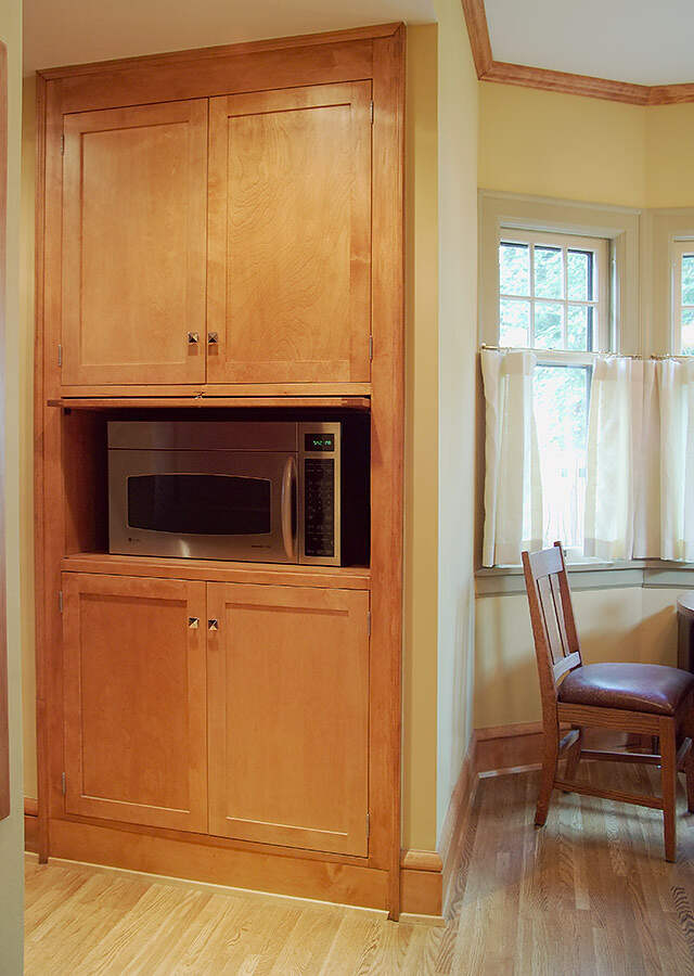
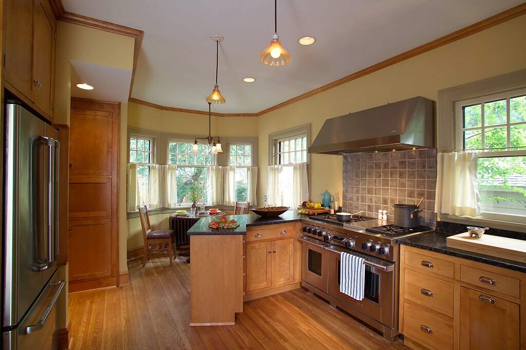
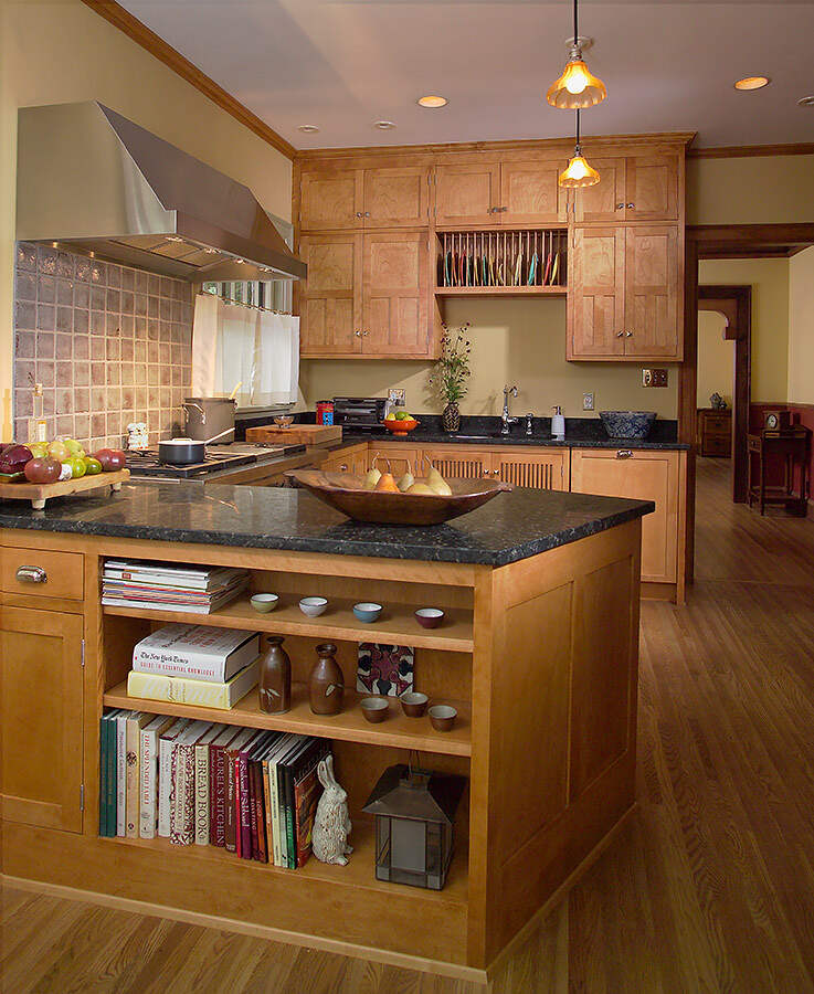
The kitchen had been recently remodeled quite poorly. (Luckily we were able to find new homes for the cabinets and appliances. The granite counters were sent to a printmaking cooperative where they now serve as inking slabs.) The new design features a professional range (the homeowners are avid chefs), honed granite, custom period cabinetry complete with a roll out step under the sink to provide better access to upper cabinets. The new layout allows for more than one person to be in the space without it feeling cavernous when there is just one. An angled peninsula separates a breakfast sitting area from the rest of the room and keeps traffic out of the work space. The cabinets facing the eating space are double sided with bookshelves on the back and full access to the otherwise dead corner by the stove. The custom designed pantry has a number of features including a built-in Microwave with rolling shelves.
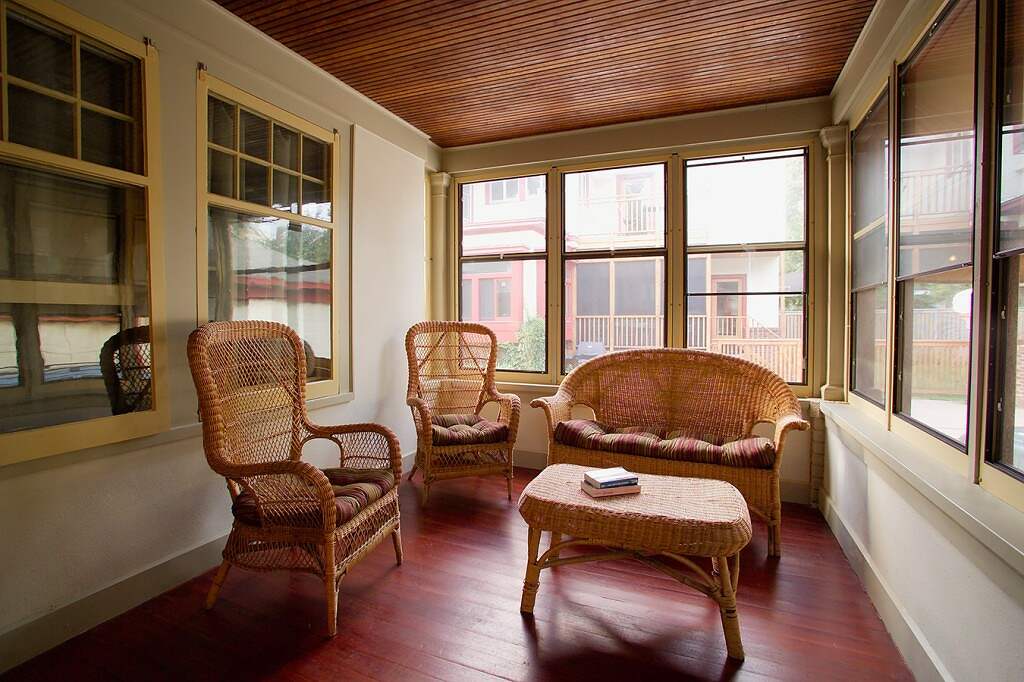
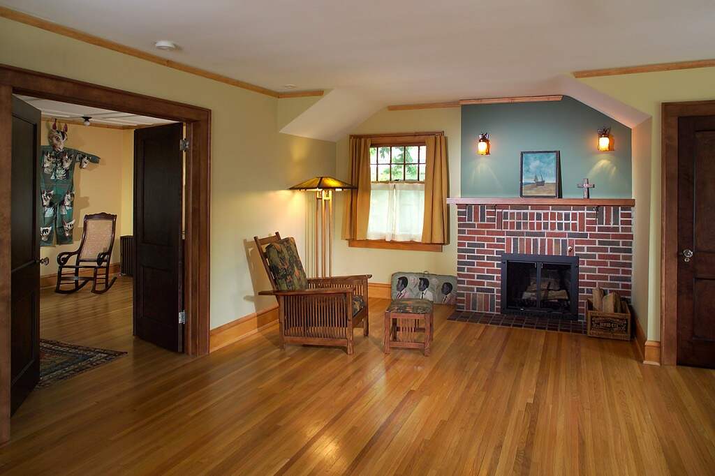
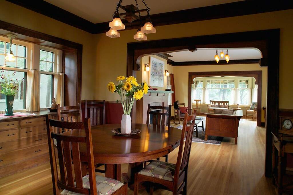
New mantles and fireplace surrounds were designed with the help of the homeowner, as were new corbels to create formal arches between the living room, dining room, and sun room. We decided to tri-tone the stain using a combination of dark red-brown, medium red-brown, and a dark honey-amber. This helped to keep the wood from feeling overly dark and create definition for the different planes.
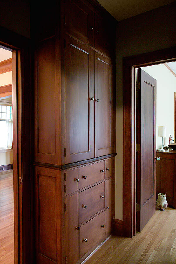
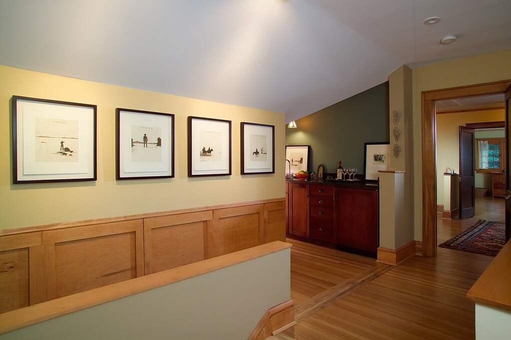
A gallery and mini-bar were created out of a knee wall space and old illegal laundry. By shifting the load on the wall we were able to create both a viewing space as well as flat-file storage concealed by the period style wall paneling.
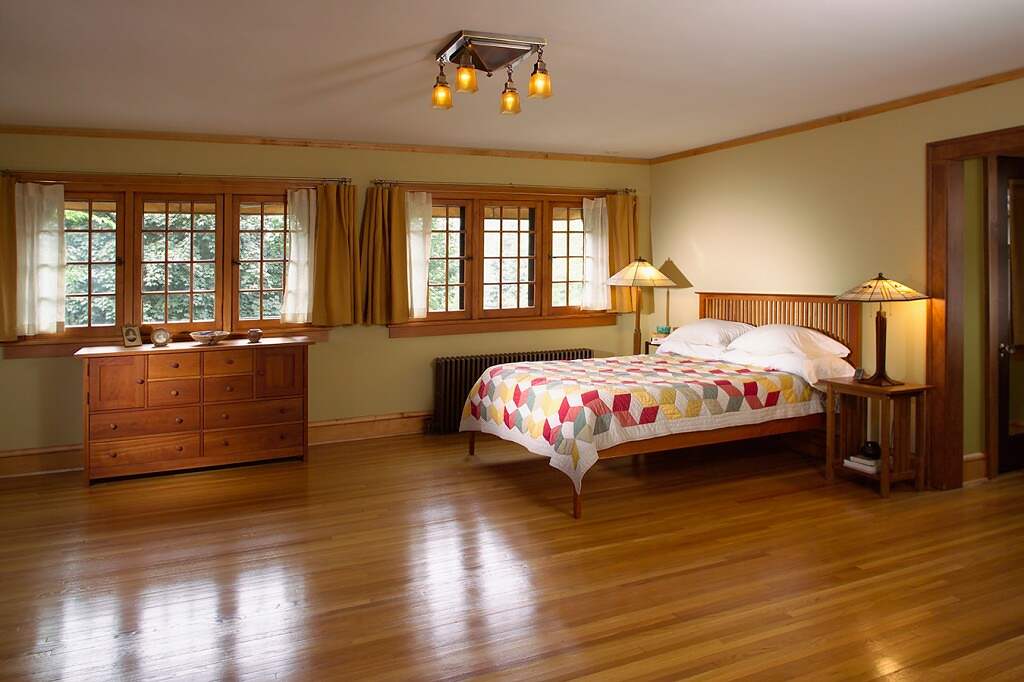
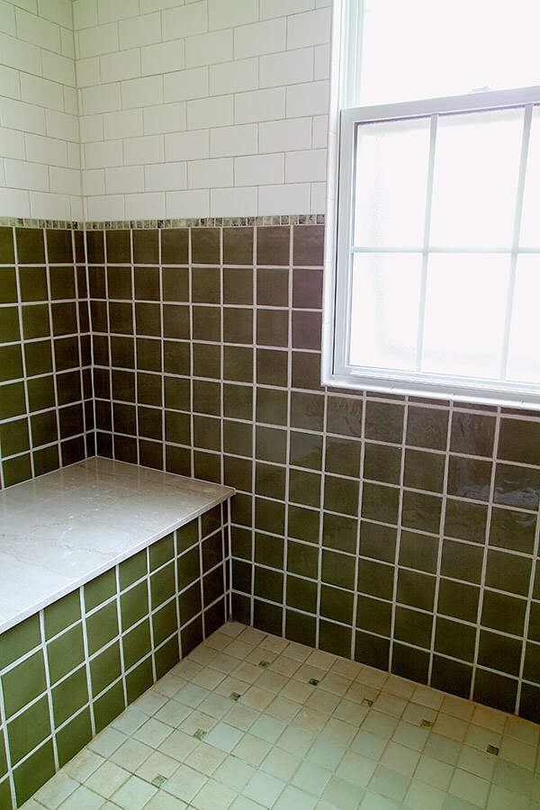
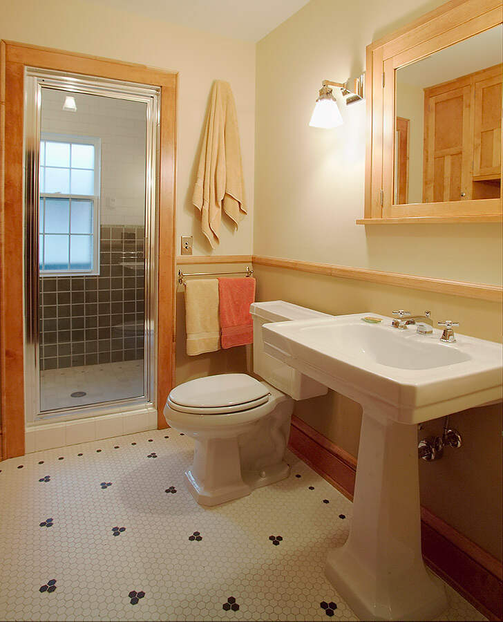
The master suite was redesigned to include three modest closets. The fireplace was rebuilt with brick similar to the original. The French in-swing windows were all striped and refinished. The bathroom was enlarged and now includes a full set of custom period cabinets with a Birch countertop on one side, a pedestal sink, custom medicine cabinet to match on the other, and a large steam shower in the back. The tile work was all designed to be reminiscent of the period, mixing greens with creamy subway tile. The seat which holds four people is a piece of reclaimed limestone. The wire-cut unglazed porcelain hexagon tile the covers the main bath floor is heated for ‘extra’ comfort. The room adjacent to the Master bedroom was redesigned as a sitting room with two half walls creating a visually (not physically) partitioned space.
The light fixtures are a combination of antique period fixtures and replicas. The fixture in the sun room was designed and built by the homeowner to hold the shades that had been reclaimed from an old hotel. The switches are all period style push-button with pearl tips.
The colors were selected from a primarily historical palette, and add life to the previously gray walls. The use of color to influence the space plays a subtle yet integral role in renovating this home completely.
Highlights
- 2006 Chrysalis award
- 2006 COTY award
- 2006 ROMA award
- 2005 COTY award
- Custom period cabinets
- Custom period tile work
- Historical color
- Remodel within existing footprint
- Concealed storage
- Steam shower
- Gourmet kitchen
- Refurbished millwork, doors, and windows
- Antique light fixtures

